TollGuru is a free trip calculator for toll and gas prices, comparing cheapest and fastest routes depending on vehicle type, model, and fuel efficiency
Timeline
2 months
Research: 2 weeks
Wireframing: 1 week
Prototyping: 1 week
Usability testing: 1 week
UI design: 3 weeks
Wireframing: 1 week
Prototyping: 1 week
Usability testing: 1 week
UI design: 3 weeks
My Role
User research, interface design, prototyping, wireframing, usability testing, and rebranding
Constraints
Due to COVID-19, I was unable to conduct user research and usability testing in person, and used video calls and screen sharing to navigate these limitations.

Problem
The TollGuru mobile app helps users calculate the least expensive route when taking long trips, including the cost of tolls and gas. The process it takes to generate this information, however, is tedious and confusing.
Extraneous steps, redundant interface elements, and a non-linear flow make using TollGuru difficult—especially when the purpose of the app is to simply calculate the price details of a trip.
Goal
Simplify and clarify the process of the app into a more linear step-by-step experience, removing irrelevant sections, and improving accessibility of the interface to better include a broader audience.
Process
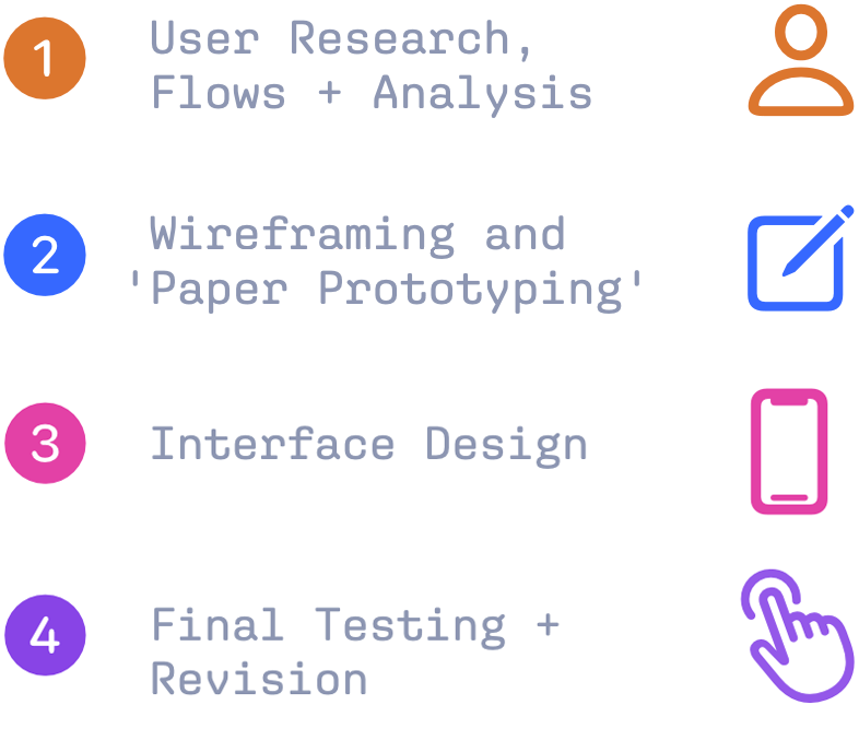
Research
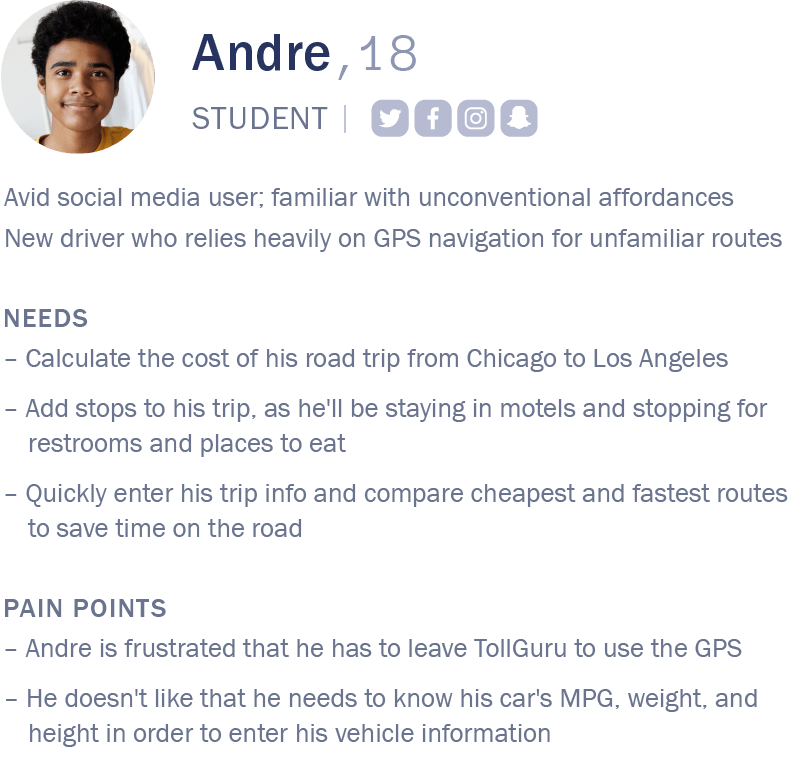
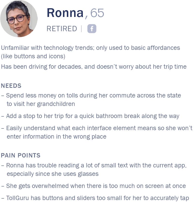
Users

User Flows
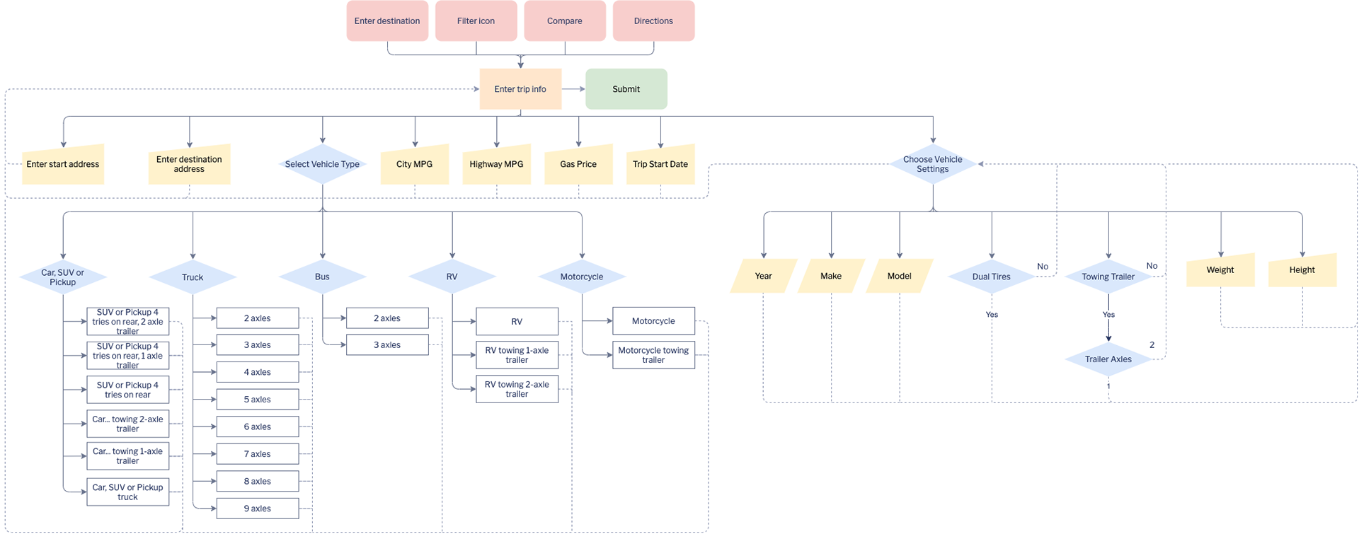
The original flow was confusing, and the user had to make too many decisions to enter their trip and vehicle information. The user would need to continually go back to the "enter trip info" step (orange rectangle, below) to enter each trip detail.
Since all input elements were displayed at once, Andre didn't like that there was information needed that he didn't know, like 'MPG', weight, and height—and skipped over input fields that he should have filled out as he had limited time constraints.
ORIGINAL FLOW
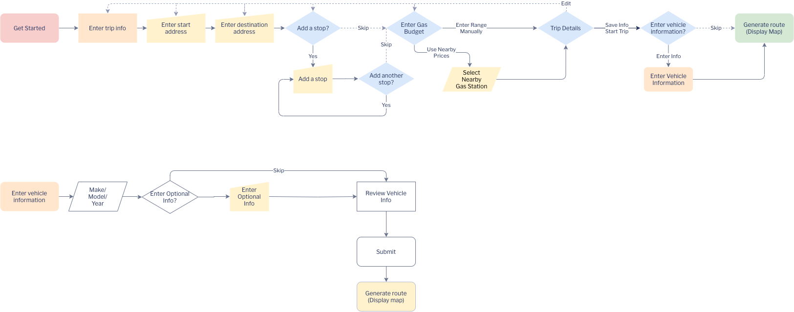
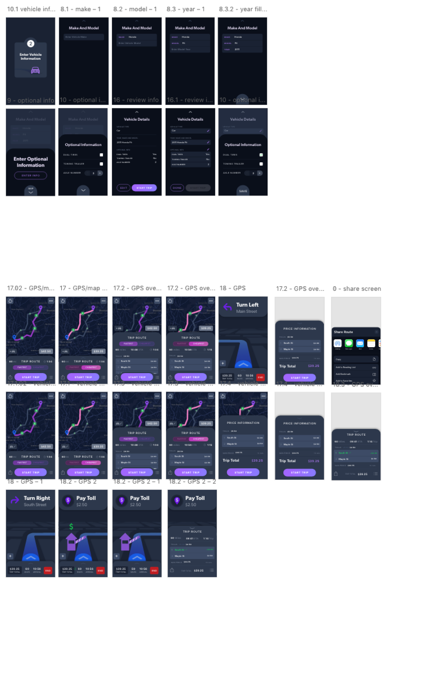
In order to make this process simpler, I ordered the manual input steps so that the user would only need to enter one input at a time per screen. This makes it so that the user doesn't feel overwhelmed by multiple input options, and can more efficiently enter their trip information without missing redundant steps—especially helpful for Ronna.
UPDATED FLOW

Analysis
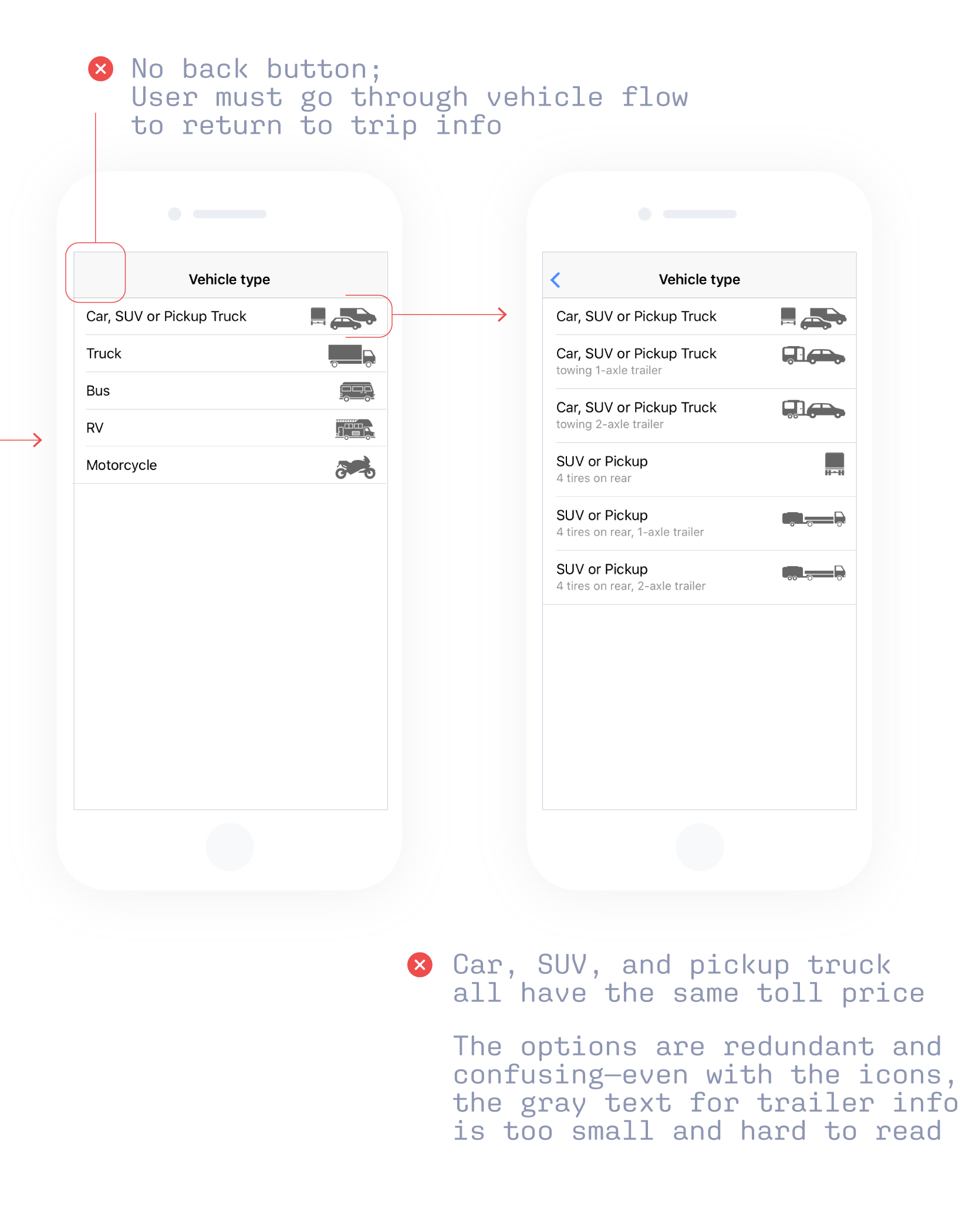
ORIGINAL INTERFACE

Process
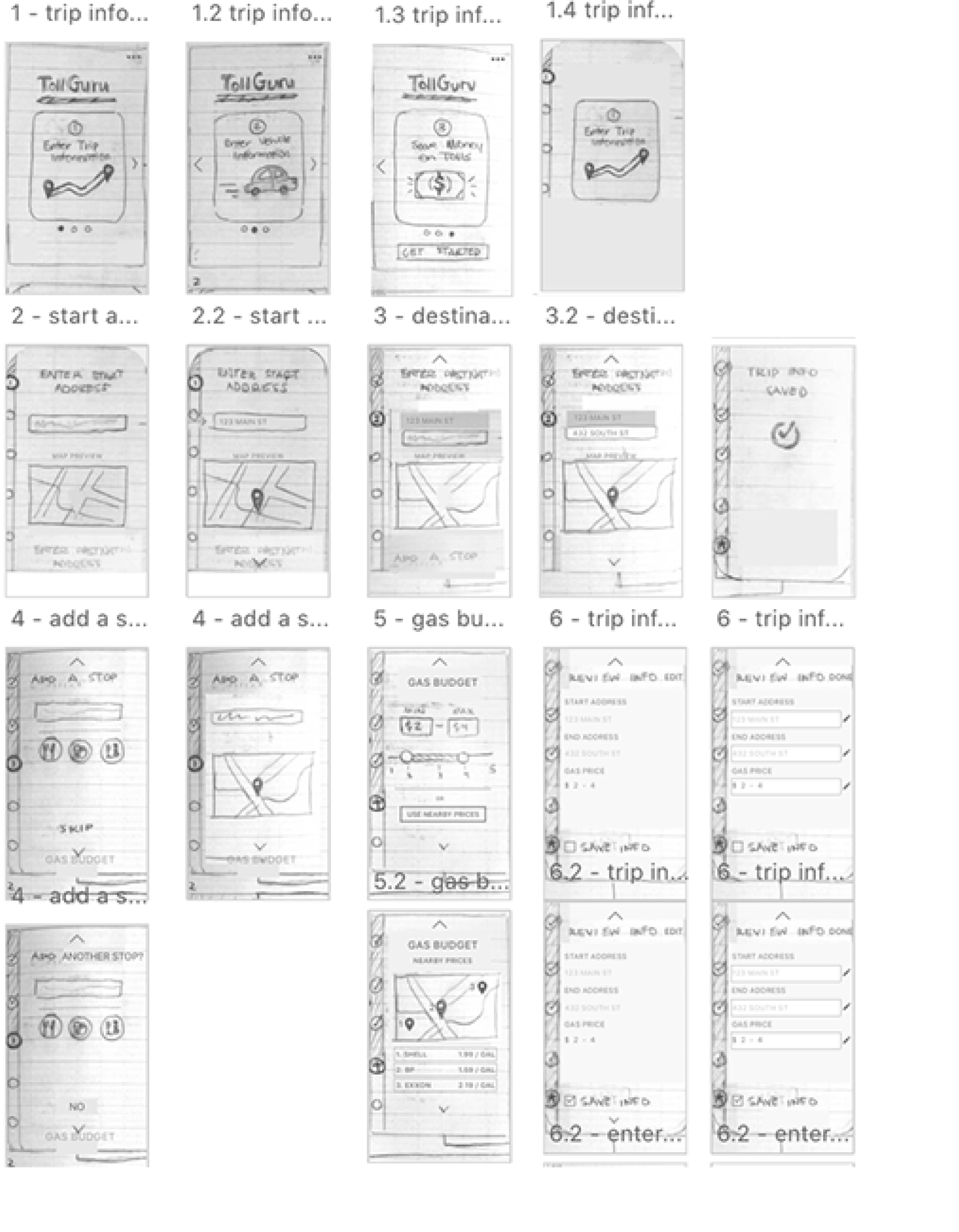
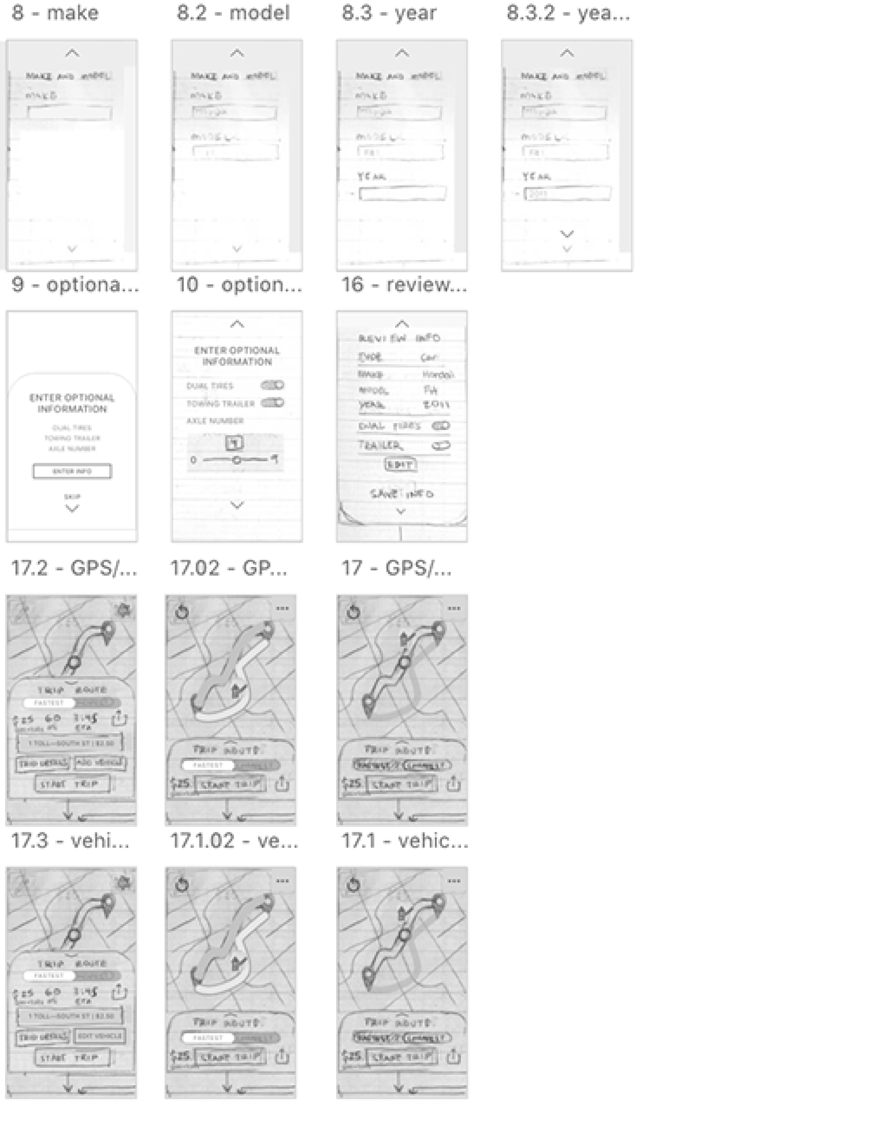
Wireframing
Each screen was drawn in my sketchbook, photographed, and wired as screens for a "paper prototype" that served as a low-fidelity way to conduct usability testing.
The wireframes were used as the basic structure for the interface design stage of the project, and the low-fidelity prototype helped me highlight and discover changes when testing.
Usability Testing
I conducted two rounds of usability texting, the first round with 2 testers and the second round with 4—concluding with 6 individual "paper prototype" tests to guide UX and interface decisions and potential changes.
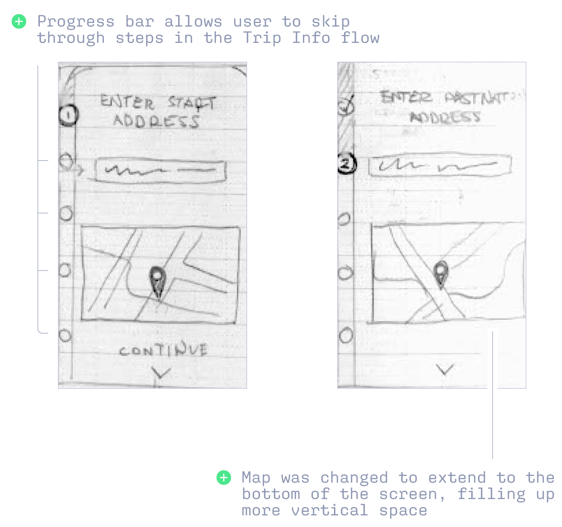
Testers wanted to use the circles designating incomplete steps on the left progress bar, expecting to skip through steps in the Trip Info flow. This helped me refine my prototype and add interactivity to more subtle affordances, linking more sections together.
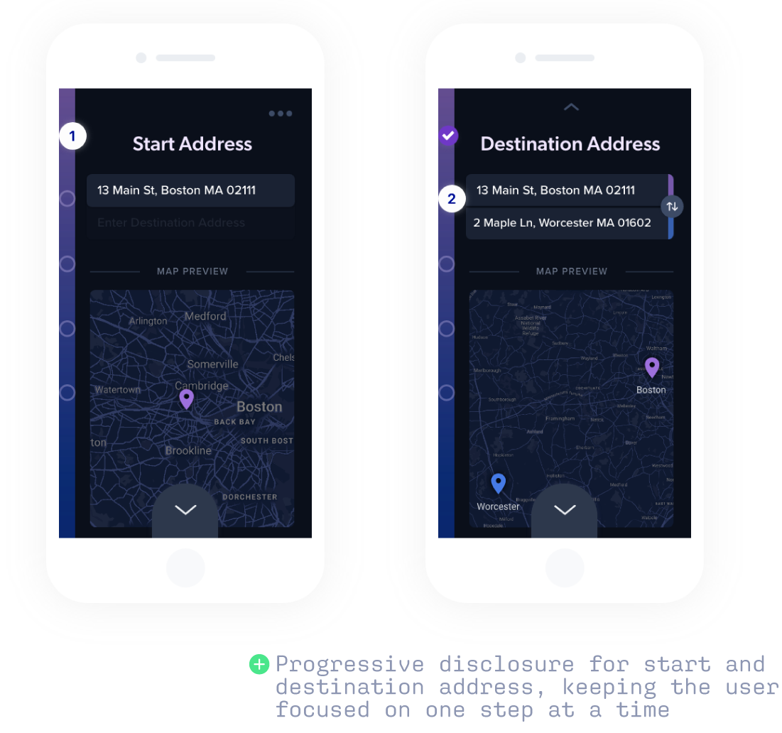
This also guided me to reevaluate the flow—based off the original flow of TollGuru—and further simplify the user journey to make the app experience as seamless and intuitive as possible. Relevant changes include making the start and destination addresses on the same screen, but done through progressive disclosure to help the user stay less distracted by multiple input fields.
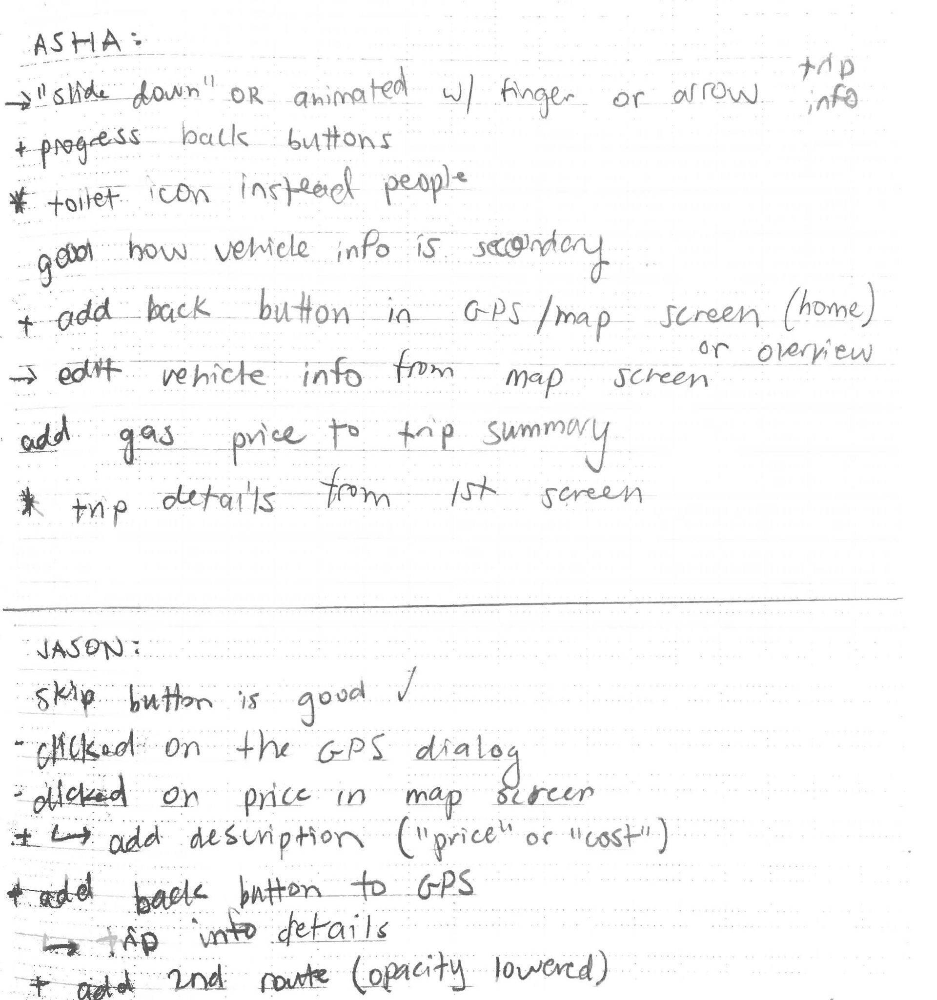
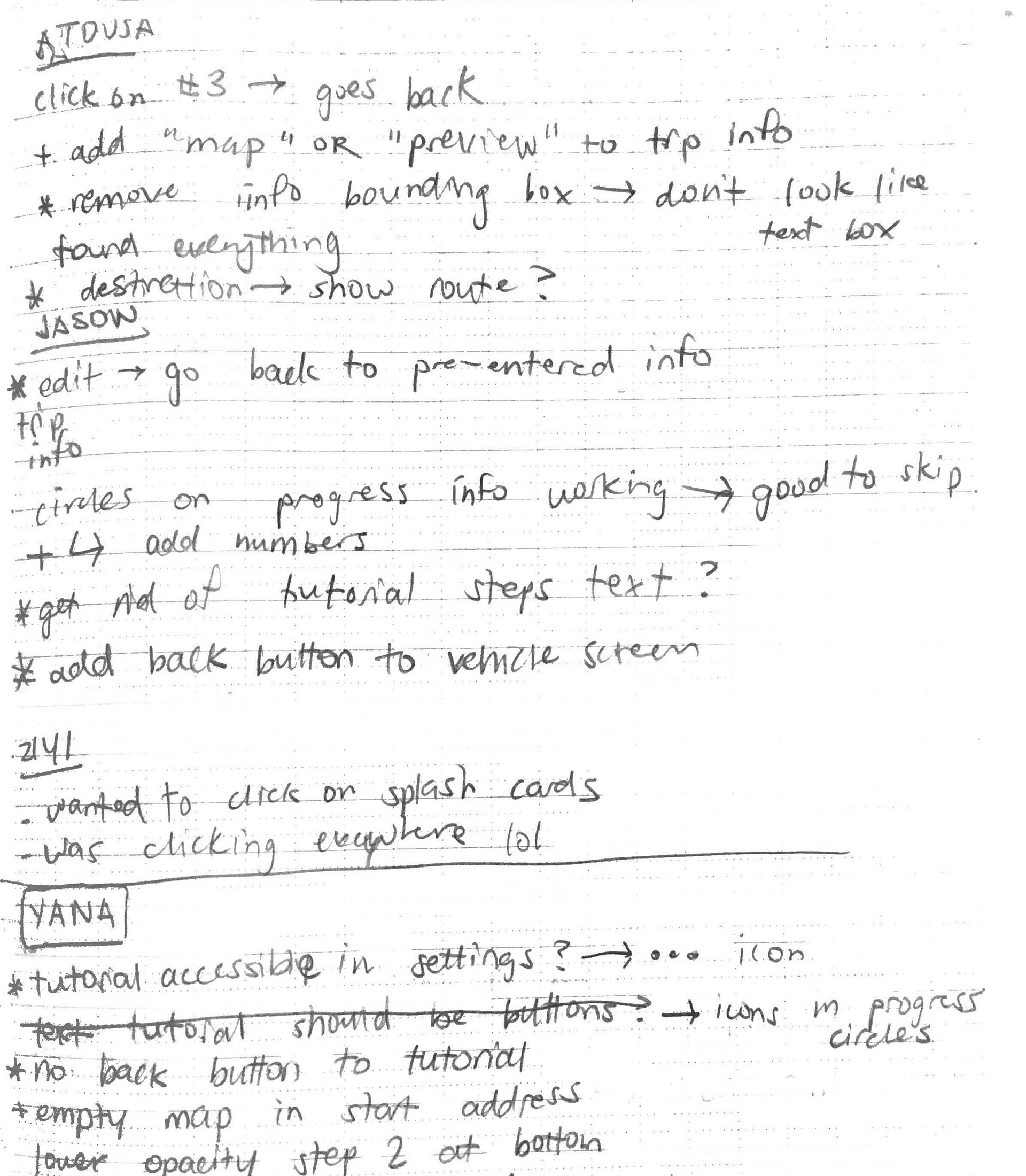
My notes were taken during the live "paper prototype" sessions, set up using video calls and screen sharing to get a more personal experience, allowing for better understanding of feedback than more remote methods
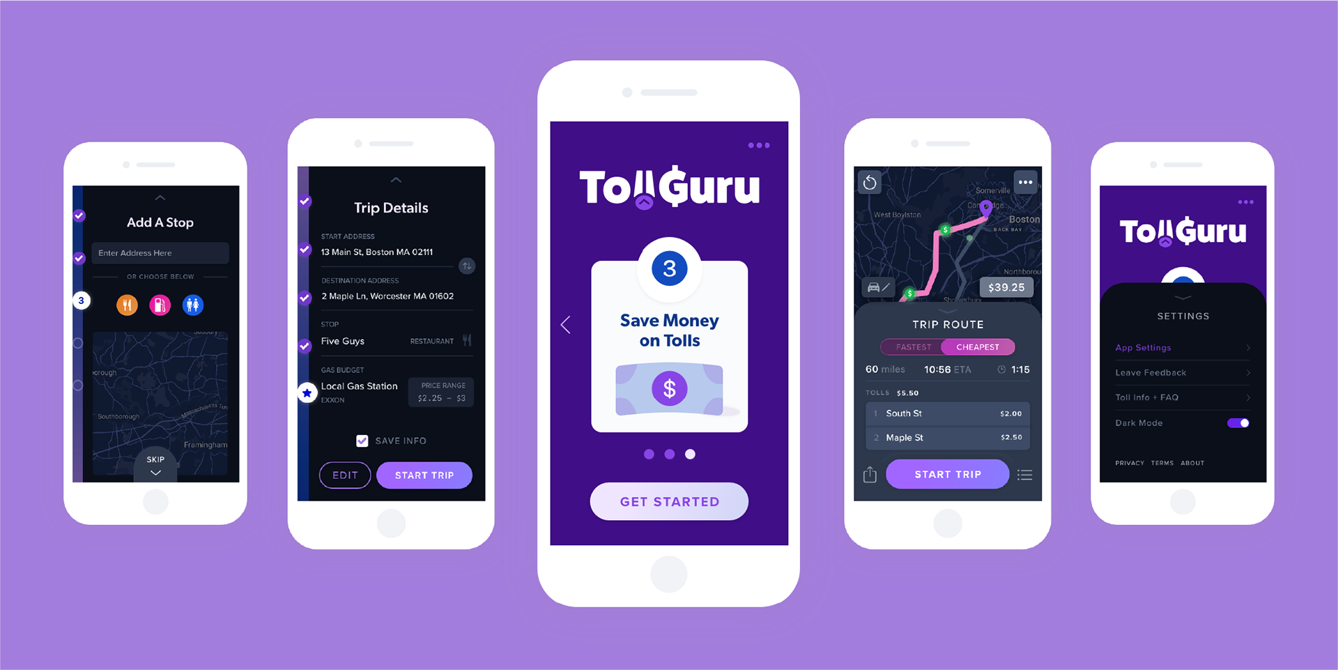
Interface Design
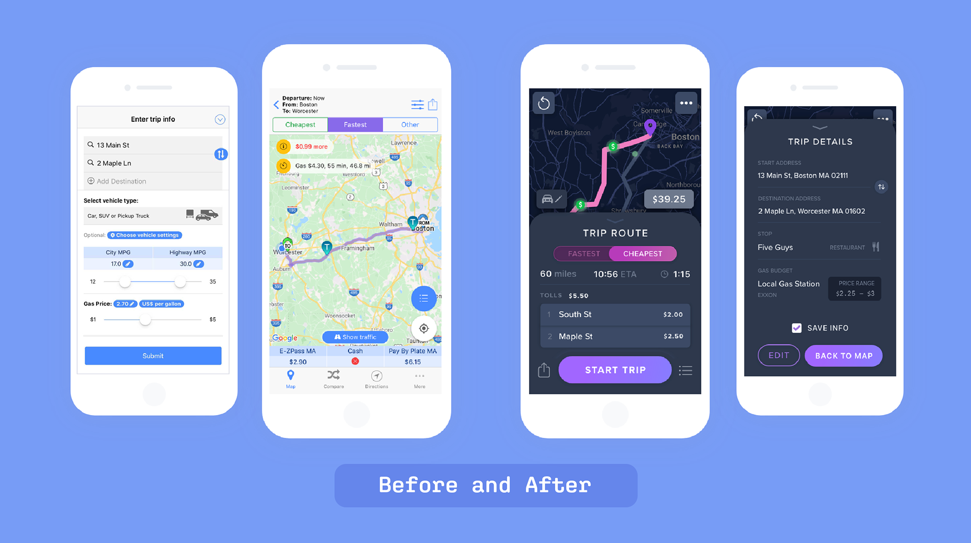
WIREFRAME → FINAL INTERFACE
When transitioning from wireframes to final interface screens, I found insight from my usability testing phase to be useful,—helping me refine bottom-screen progress buttons, icon color, type hierarchy, and the general layout of multiple element groupings.
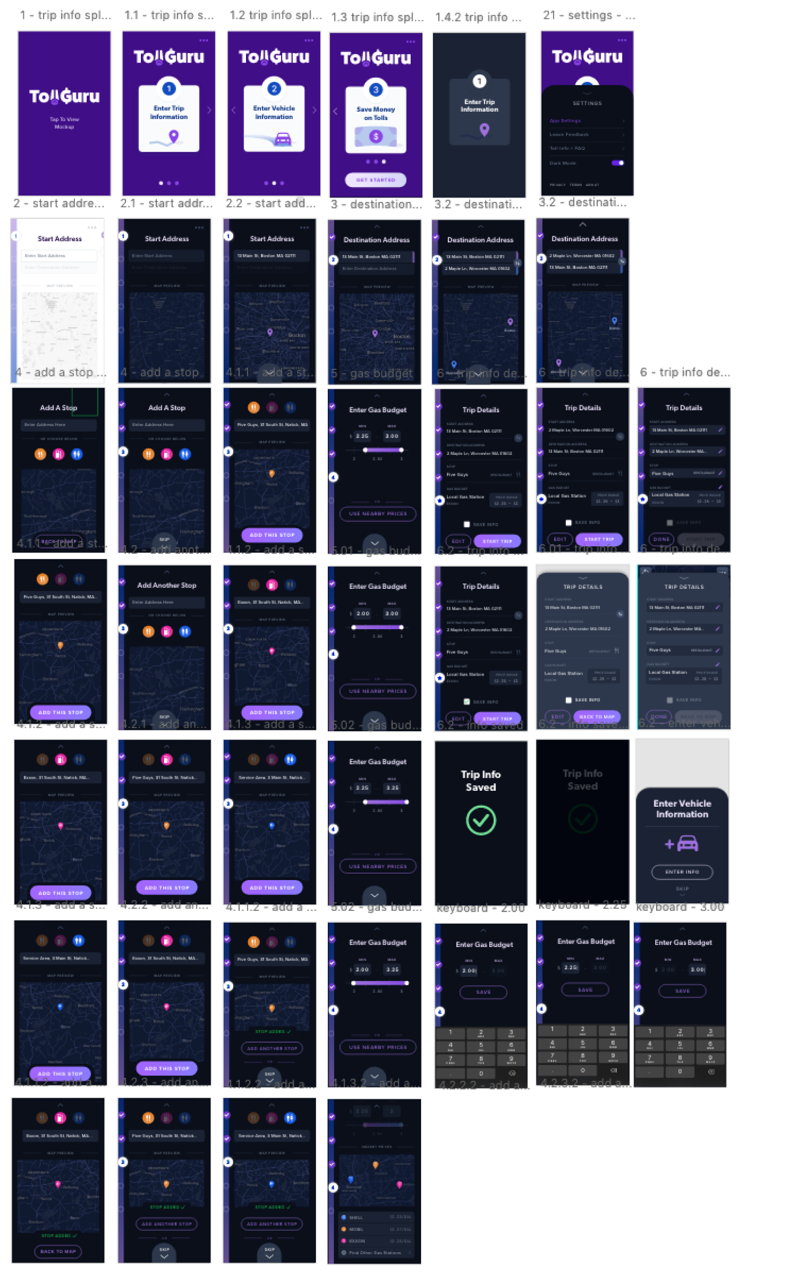
After finalizing additional screens and interactions, I ended up with over 55 individually designed screens (not all shown) that were fully interactive and prototyped. This process took roughly 4 weeks, with regular group critique to refine additional choices.
Final structure changes included adding a Trip Details screen that offered an information overview, making the Vehicle Info flow more minimalist with more automatic info detection, and adding manual input through the numeric keypad.
Outcome
Takeaways
Being my first full-scale UX project, I learned a lot through this process. I found the analytical, research-focused tasks engaging and gained a better understanding of hierarchy for digital content on smaller screens. Making an intentional decision to represent distinctly different users helped me prioritize an experience and interface that provides for better inclusion of 'stress cases'.
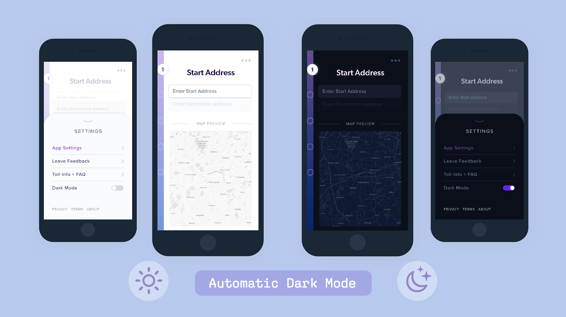
Emphasizing the importance of usability and accessibility, I made all text fields and interface elements compliant with WCAG AA accessibility guidelines. All sliders, buttons, and form fields are large enough for easy touch targets, with main CTA buttons at the bottom of the screen for easier one-handed use for both left- and right-handed users.
Overall, this redesign of the TollGuru trip calculator app improves the user's experience through a simpler flow, more accessible interface, and overall experience focused on usability.
